CASE STUDY: REDEFINING HEALTHCARE

Client Challenge
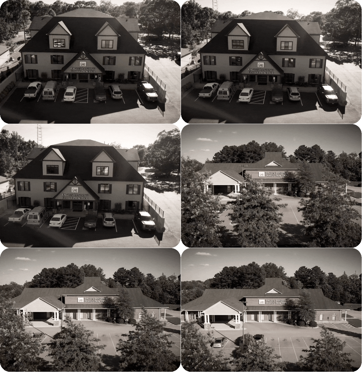
Eagles Landing Health wanted to expand from a regional network of clinics into a national healthcare brand. But their old identity — names tied to geography and service lines — couldn’t scale. They needed a brand that was clear, compelling, and memorable across markets.
At the same time, healthcare is one of the most competitive advertising landscapes. To succeed, Aylo had to do more than rebrand — they had to stand out.

The Narwhal Approach
As lead strategist while at Between Pixels, I spearheaded Aylo’s transition:
Research & Validation – Led focus groups and surveys to uncover pain points. Patients were frustrated with confusing costs, poor communication, and long waits. What they wanted was kindness, convenience, and clarity.
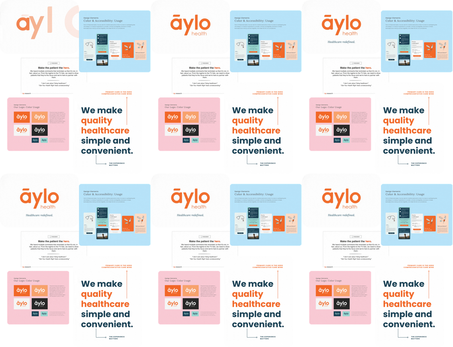
Messaging Foundation – Developed a messaging guide and wheel anchored around three promises: Quality. Convenience. Hospitality.
Brand Creation – Crafted the name Aylo (styled āylo), paired with the slogan “Redefining Healthcare.” The brand identity leaned on a dictionary-style definition to reflect the promise of a fresh start.
Ad Framework – Designed a five-year roadmap with phases: Seed, Teaser, Soft Launch, Full Launch

Creative Execution
Aylo launched with multi-format campaigns designed to work across the funnel:
Teaser Ads – Real “healthcare horror stories” dramatized into relatable, funny reenactments with the promise: Better healthcare is coming.
Experiential Ads – Heartwarming in-office moments, showing doctors listening and caring, reinforcing Primary Care that Cares.
Aspirational Ads – Nike-inspired storytelling, featuring people doing “amazing things” thanks to good health.
Integrated Digital – Built nurture journeys and the Digital Health Guide, an interactive report giving patients personalized advice, then guiding them toward becoming patients.
Agile Advertising – Created a system for quick-turn content tied to cultural moments, ensuring Aylo stayed relevant and relatable
Results & Impact
Successfully launched a scalable national brand recognized for optimism, clarity, and accessibility.
Patients in focus groups said, “Sign me up” after experiencing the new positioning.
Messaging tested strongest when it paired simplicity with quality and empathy, validating the core brand promise.
Campaigns established Aylo as a healthcare provider that feels modern, friendly, and human - a far cry from traditional, sterile healthcare ads.
Key Takeaway:
Healthcare is broken — but how you tell that story matters.

By grounding Aylo’s brand in patient frustrations and delivering hope through strategy and creative, we redefined what primary care could look like for new markets.
Ready to dive in?
If you’re ready to stop blending in and start making waves, book a free 15 minute Captain’s Chat today!
Curious what kind of waves we could make together? Hop on a quick call with Captain Heather to chart the course. No pressure, no sales pitch — just a friendly creative conversation to see where your brand could go next.
Deliverable: A 15-minute Zoom call + a follow-up email with one personalized suggestion or resource.
Perfect for: Anyone who’s brand-curious or campaign-confused.

