Brand
Guide
This guide will ensure every design looks stellar if you follow one rule above all: use what is in this guide. Do not add colors, fonts, or design styles from outside this system.
Color System
First, here are all your brand colors in one place, but keep scrolling because these colors have rules about how to use them.
Use these for headlines, body copy, captions, and subtle outlines. Never use Earth or Warm Taupe as filler colors or large background shapes.
Black and white are not OK for normal branded design. They should only be used when a format has a true practical limitation, like a fax, a basic form, or a print situation that does not allow color.
- If it is something you can design in Canva, do not use a pure white background. Use Off-White instead.
- Earth is the darkest shade allowed in normal branded materials.
- Do not use black as a design choice for headlines, body copy, shapes, or backgrounds.
- Do not build branded layouts in black and white just because it feels simpler.
- Only use true black and true white when the format itself requires it.
How to Use These Colors
The Go Soar brand only works if there is plenty of open space. The brand is colorful, but restrained. Too much color makes the brand feel chaotic rather than inviting.
Use this order every time you build a pageFinished designs should be made up of at least 60% Off-White space. Off-White should be your main full-page background color.

Add your large colors next. Most pages should use 2 to 4 approved colors total, not including Off-White or text colors.
Doodles bring the brand to life, but they should support the layout, not take over. Use them last, once your page colors are already set.

Approved Color Systems
Choose the page’s approved color suite first, then choose doodle colors based on the main color block you are working inside. These two systems are meant to work together.
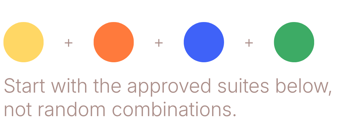
Approved Color Suites
Start with an Off-White background, then build your layout using one of the approved suites below. The brand should stay rooted in Sun and Tangerine energy.
Use these suites for major shapes, cards, accents, and supporting doodles. Off-White should still do a lot of the work so the page stays open, bright, and restrained.
Approved Doodle Colors
If your main element is one of the colors below, click the plus to see which doodle colors work well with it. You do not need to use every option every time.
Example: if your main shape is Cobalt, Off-White doodles may be all you need. You do not also need to add Sky unless the layout benefits from it.
Doodles should support the layout, not take it over. Usually one or two doodle colors is enough.
What Not to Do with Color
These rules protect the brand from feeling cluttered, off-tone, or inconsistent. If something falls into one of the categories below, it should not be used.
When in doubt, simplify. More Off-White, fewer colors, and fewer doodles will almost always make the design feel more like Go Soar.
Fonts
Keep type simple and readable. Titan One gets attention, Inter Light carries the information, and Covered By Your Grace adds warmth in small doses.
- Use for headlines, titles, and big callouts
- Usually all caps
- Best in Earth or Tangerine
- Never use for body copy
- Use for body text, subtitles, captions, and supporting information
- Earth for primary body text, Warm Taupe for softer supporting text
- Never use Inter Regular. Light is the preferred weight.
- Use for emotional phrases, notes, arrows, and handwritten moments
- One moment per layout is usually enough
- Never use for body copy or long passages
Logo Usage
The Go Soar logo should clearly identify the brand, not decorate the page. In most cases, the primary logo belongs on an Off-White background. A special Sun background with the Tangerine logo is also approved. Use reverse or black and white versions only when the background or format truly requires it.

This is the default and preferred use of the logo.

Approved for special branded moments that need extra warmth and energy.

Use when the background is dark or highly saturated.

Only for forms, print limitations, or true black and white use cases.
Again, black and pure white are not brand colors. Use them only for practical black and white situations like forms, printing limitations, or basic documents. In branded materials, use Off-White instead of pure white whenever possible.
Keep the logo clear, readable, and separate from other elements. When non-designers are using the logo, these are the most important rules to follow:
- Use the Off-White version as the default choice.
- Use the Sun background version only as a special approved variation.
- Use the reverse logo when the background is dark or highly colorful.
- Use black and white only when color is not possible.
- Always leave generous empty space around the logo.
- Do not place text, doodles, or shapes too close to the mark.
Brand Shapes
Everything should feel soft, friendly, and slightly playful. Use only the approved shapes and doodles in this section so the brand stays consistent.


Download the approved brand shapes here. These are the major shapes you should reuse instead of rebuilding them differently every time.
Download Brand ShapesBuild it from 3 square shapes so it stays consistent.
- Start with 1 square as your base shape.
- Add 2 more smaller squares on top of it.
- Round the corners of those 2 smaller squares.
- Trim or resize them so they only affect the corners you want rounded.
- Place them in the top left and bottom right corners of the base square.
- Group everything together once it looks right.
Search doodle in Elements, then use the Doodle style filter. Look for accents that feel hand-drawn, simple, and playful.
- Choose doodles that feel loose and organic, not geometric or polished.
- Use just a few accents per page so they support the layout instead of taking over.
- Keep stars, squiggles, and hand-drawn lines small relative to the main content.
- Repeat the same doodle style across a page so the design feels intentional.
- Avoid mixing lots of unrelated doodle styles in one layout.
- When in doubt, use fewer doodles, not more.
Photography
Go Soar photography should feel real, warm, and human. The goal is not polished stock-photo perfection. Choose images where young people look genuinely happy, relaxed, and engaged, not stiff, overly posed, or emotionally flat.

Background removed · framed in shape · a little overlap adds energy

Too posed · raw stock-photo feel · shape is not helping enough