The
Dusk
Standard.
This is an early look at where the visual identity of Southern Luxury Homes could go. Nothing here is final. Everything here is intentional. The goal is to find out what resonates before we build.

Every brand has a
point of view. Ours
starts at the lake.
It is late afternoon and the sun is nearly down. The lake is catching the last of the golden light. The tree line is going olive where the warmth hits the tops of the trees. Inside a finished home, the lights have just come on and the windows are glowing amber against a sky that is still holding color.
That moment, poised between day and dark, is exactly where the Southern Luxury Homes brand lives. We call it Dusk. Not because it is dark, but because of what dusk actually is. It is the most beautiful transition of the day. It is arrival. It is the feeling of being exactly where you are supposed to be.
It is also the moment the buyer is already imagining when they stand on their lot at Reynolds and picture the home that belongs there. The brand should place them in that feeling before a single word registers.
01 It is specific to Reynolds Lake Oconee
02 It matches the buyer's emotional state
03 Dusk is not dark. Dark is a mistake.
04 It is genuinely ownable
Dusk becomes more than a palette. It becomes the atmosphere surrounding every touchpoint.
Five colors.
One moment in time.
Each color is traceable directly back to the dusk scene at Reynolds Lake Oconee. None of them are invented. All of them are observed.
The palette begins with a real scene: warm interior light, lake reflection, dark tree line, and the blue-gray hush of dusk.
Dusk
The sky above the amber horizon. Cool near-black with a blue-gray undertone. The atmosphere.
Linen
Interior light through a window. Warm ivory, not paper. The breathing room.
Ember
Light reflected on the water at day's end. Muted amber. Never gold. The signature accent.
Olive
The Georgia treeline where warm light catches the tops. Dark and muted. Place-specific.
Stone
The quiet neutral. Supporting information without drawing attention. The workhorse.
The dark background is not a style choice. It is the brand's resting state for any premium application. Hero sections, print covers, and social media all start here. The warmth comes from the photography inside it, not the color itself.
Ember earns its place. It appears as eyebrow labels, fine rule lines, outline buttons, and subtle italic emphasis. It is the glow at the edge of things, not the thing itself. Used on large surfaces it becomes ordinary.
Restraint is the luxury signal. A crowded layout communicates anxiety. A confident layout communicates authority. When something feels heavy, the answer is almost always more space, not more content.

Two typefaces.
Two registers
of the brand voice.
The typefaces carry the same dual nature as the brand itself. One speaks to the emotion of the decision. The other earns the trust.
for this
exact
moment.
Elegant, unhurried, and italic by nature. Appears in headlines, pull quotes, section openers, and the italic moments that carry the accent color. Always at a light weight of 300 or 400. Never bold, never compressed. It should feel like something said quietly with complete confidence.
80–130px Built for this.
48–72px You found the lot.
32–48px The process is the promise.
20–28px "We do things differently."
18–24px Award-winning custom builds at Reynolds Lake Oconee.
You bring the dream. We bring the clear steps, steady updates, and honest conversations to get you there.
Clean and modern without being clinical. Confident without being cold. Used for all body text, navigation, buttons, labels, and anything the client will read for more than a few seconds. Three-quarters of the typographic weight on any given page.
8–10px Reynolds Lake Oconee
9–10px See What's Possible
14–16px From lot walk to handover, you know exactly where things stand.
11–12px Weekly updates. Photo documentation. One contact.
Manrope at 78%. Everything the client reads closely. Body copy, navigation, buttons, labels, captions. The ratio keeps Cormorant feeling like it earns its presence.

The decisions you
don't make define
the brand too.
The Dusk direction works because it has restraint. It is not just a set of colors or a luxury mood. It is also a clear set of decisions about what Southern Luxury Homes should avoid.
Dark for drama's sake
A dark palette used for theater reads as heavy and closed. This palette is dark because dusk is dark, and because the buyer is standing in that dusk moment. The distinction matters in every image choice, every section layout, and every photography brief.
Gold as the luxury signal
Gold announces wealth. Ember reflects light. Every luxury brand in the category has reached for gold. Ember is specific to this lake, this hour, this home. It is not a color that announces luxury. It is a color that describes a moment.
Heritage Southern craft
Warm ivory as the dominant background, brass accents, a heritage serif and a nod to Southern tradition is a perfectly valid brand for a different builder. Southern Luxury's point of view is forward-looking, atmospheric, and place-specific. Heritage is not the story.
Compressed and decorated
Adding more elements when a layout feels incomplete is the instinct. Fighting that instinct is what creates the luxury feeling. Space, restraint, and selective use of accent color are what separates this from every other high-end builder site in the market.
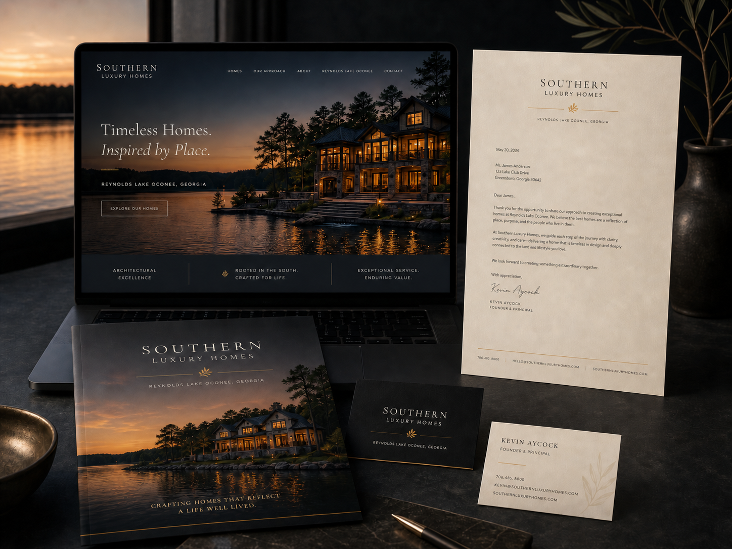
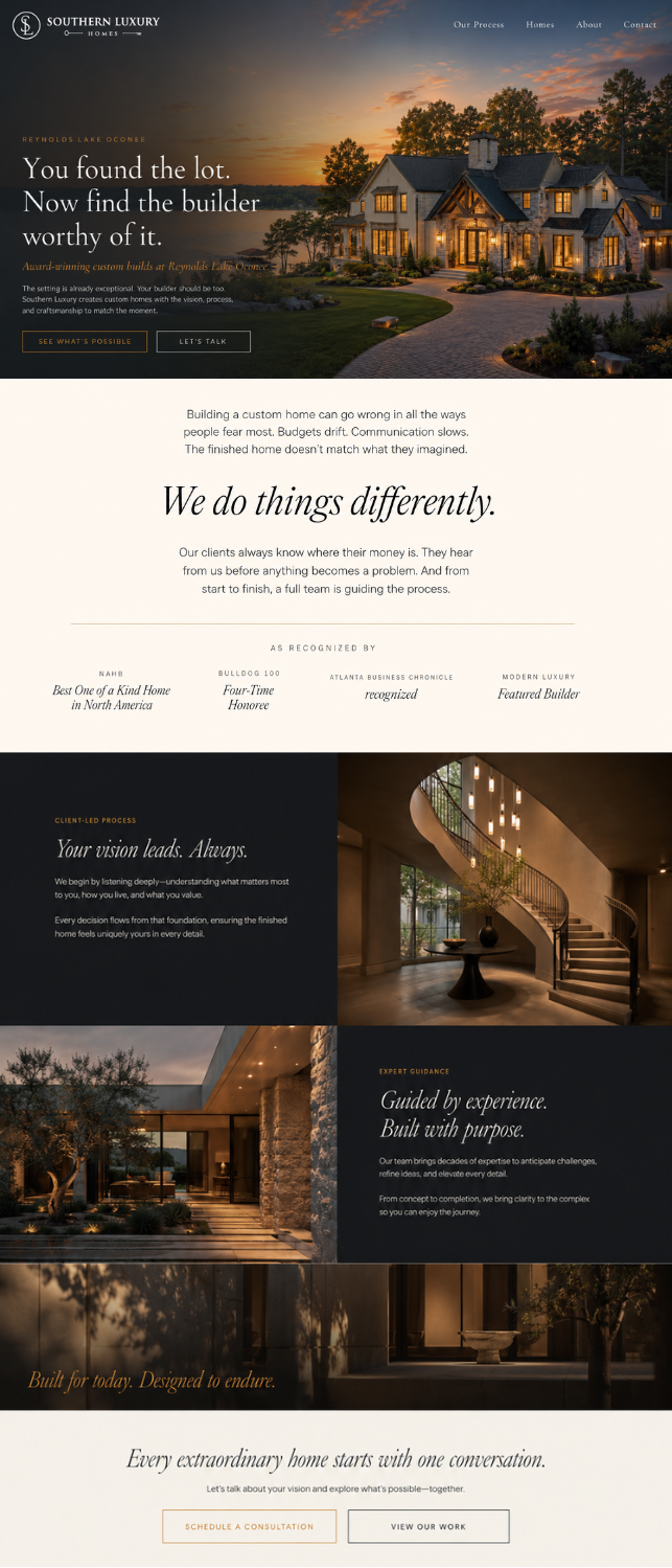
What it looks like
when it works.
These mockups are meant to show the direction in context: how the palette, type, photography, spacing, and overall atmosphere begin to work together across digital and printed brand materials.
Click either image to open a larger view. The copy inside the mockups is AI-generated placeholder text, so please focus on the visual direction, not the exact wording.

Knowing what you love is the goal.
Knowing what you don't is just as useful.
This is an early direction, not a final answer. The palette is proposed. The typefaces are proposed. The layouts are directional. What matters at this stage is your honest reaction, because that reaction is what we use to build something that actually belongs to Southern Luxury Homes and no one else.
Nothing here is precious. If it doesn't feel right, say so. That's the whole point of showing it early.